3.2 Graphics - 绘图
相关联考试题:2.1 Theoretical - Data Visualization
#library #ggplot
library(ISLR)
library(tidyverse)
What is ggplot?
#histogram #barplot #scatterplot
#绘制histogram
hist(Hitters$Salary, xlab = "Salary in thousands of dollars")
#绘制barplot
barplot(table(Hitters$League))
#绘制散点图代码1
Default %>%
  arrange(default) %>% # so the yellow dots are plotted after the blue ones
  ggplot(aes(x = balance, y = income, colour = default)) +
  geom_point(size = 1.3) +
  theme_minimal() +
  scale_colour_viridis_d() # optional custom colour scale
print(Default)
#不调用ggplot2而直接添加一行layer,会出问题,为了保险最好还是复制一遍已有表格代码然后添加
#绘制散点图代码2,使用ggplot2
homeruns_plot <-
  ggplot(Hitters, aes(x = Hits, y = HmRun,colour = League, size = Salary)) +
  geom_density_2d() +
  geom_point() +
  labs(x = "Hits", y = "Home runs", title = "Cool density and scatter plot of baseball data") +
  theme_minimal()
homeruns_plot #添加这一行才会显示出图表
==Name the aesthetics, geoms, scales, and facets of the above visualisation. Also name any statistical transformations or special coordinate systems 见2.1
Aesthetics and data preparation
Run the code below to generate data. There will be three vectors in your environment. Put them in a data frame for entering it in a ggplot() call using either the data.frame() or the tibble() function. Give informative names and make sure the types are correct (use the as.<type>() functions). Name the result gg_students
#tibble比dataframe更方便,可以少设置一个内容

set.seed(1234)
student_grade  <- rnorm(32, 7)
student_number <- round(runif(32) * 2e6 + 5e6)
programme      <- sample(c("Science", "Social Science"), 32, replace = TRUE)
gg_students <- tibble(
  number = as.character(student_number), # an identifier
  grade  = student_grade,                # already the correct type.
  prog   = as.factor(programme)          # categories should be factors.
)

head(gg_students)
#aesthetics
Examples of aesthetics are:
- x
- y
- alpha (transparency)
- colour
- fill
- group
- shape
- size
- stroke
#geoms
参考2.1
Visual exploratory data analysis
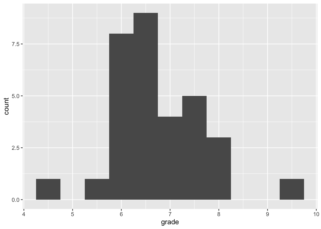
#histogram
#绘制histogram
gg_students %>%
  ggplot(aes(x = grade)) +
  geom_histogram(binwidth = .5)
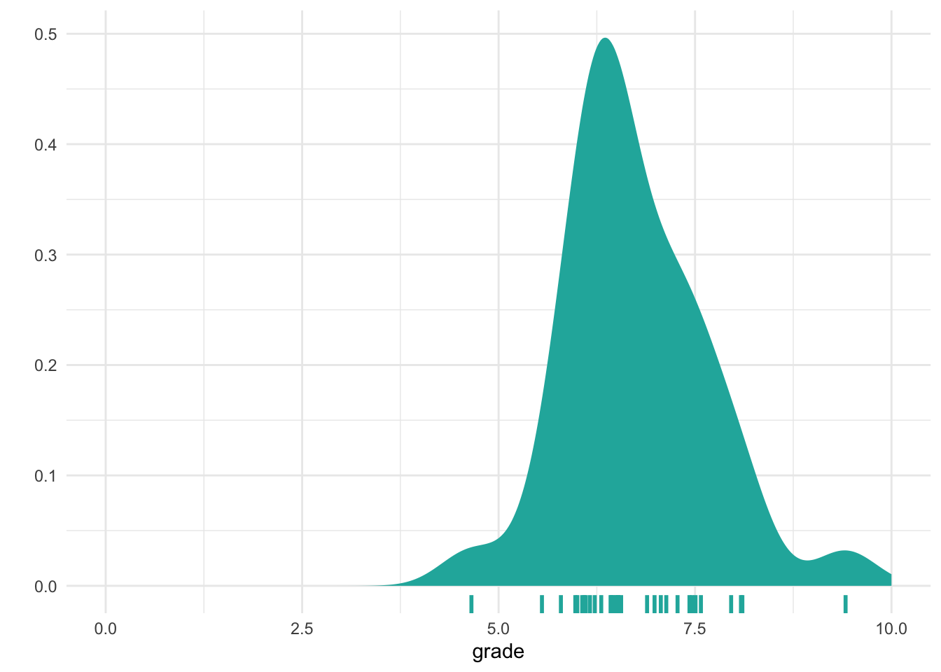
#densityplot
#绘制density plot
gg_students %>%
  ggplot(aes(x = grade, fill = )) +
  geom_density(fill = "light seagreen", colour = NA, alpha = ) +
  geom_rug(size = 1, colour = "light seagreen") +
  scale_fill_brewer() + #渐变色卡
  theme_minimal() +
  labs(y = "") +
  xlim(0, 10)
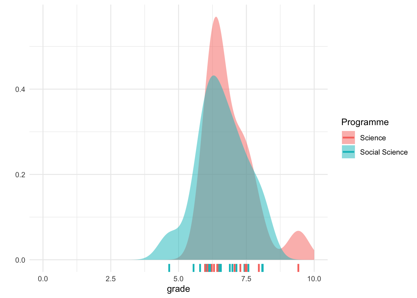
#用fill绘制多个categories的density plot
gg_students %>%
     ggplot(aes(x = grade, fill = prog)) +
     geom_density(alpha = .5, colour = NA) +
     geom_rug(aes(colour = prog),size = 1) +
     theme_minimal() +
     labs(y = "", fill = "Programme", colour = "Programme") +
     xlim(0, 10)
#boxplot
#绘制boxplot
gg_students %>%
  ggplot(aes(x = prog, y = grade, fill = prog)) +
  geom_boxplot() +
  theme_minimal() +
  labs(title = "")
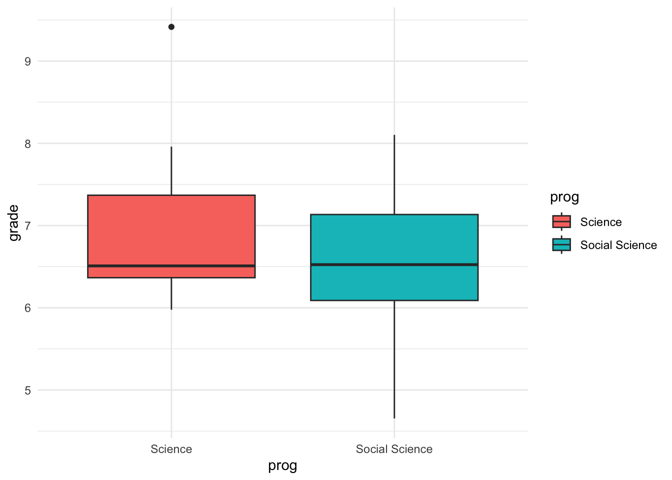
#interpretingboxplot #boxplot
#如何解读boxplot
# From the help file of geom_boxplot:

# The middle line indicates the median, the outer horizontal
# lines are the 25th and 75th percentile.

# The upper whisker extends from the hinge to the largest value
# no further than 1.5 * IQR from the hinge (where IQR is the
# inter-quartile range, or distance between the first and third
# quartiles). The lower whisker extends from the hinge to the
# smallest value at most 1.5 * IQR of the hinge. Data beyond
# the end of the whiskers are called "outlying" points and are
# plotted individually.
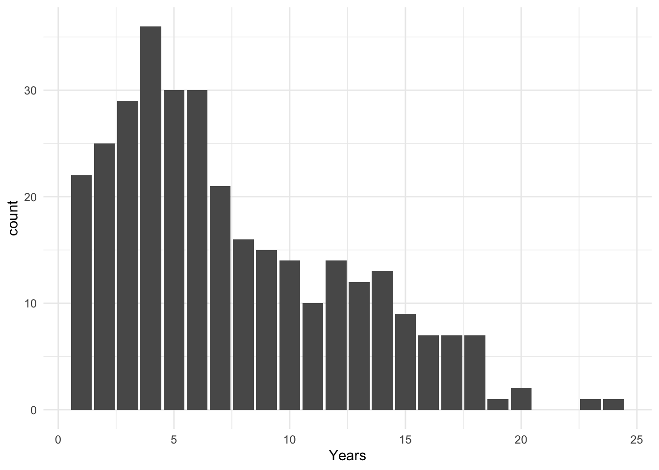
#barplot
#绘制bar plot
Hitters %>%
  ggplot(aes(x = Years)) +
  geom_bar() +
  theme_minimal()
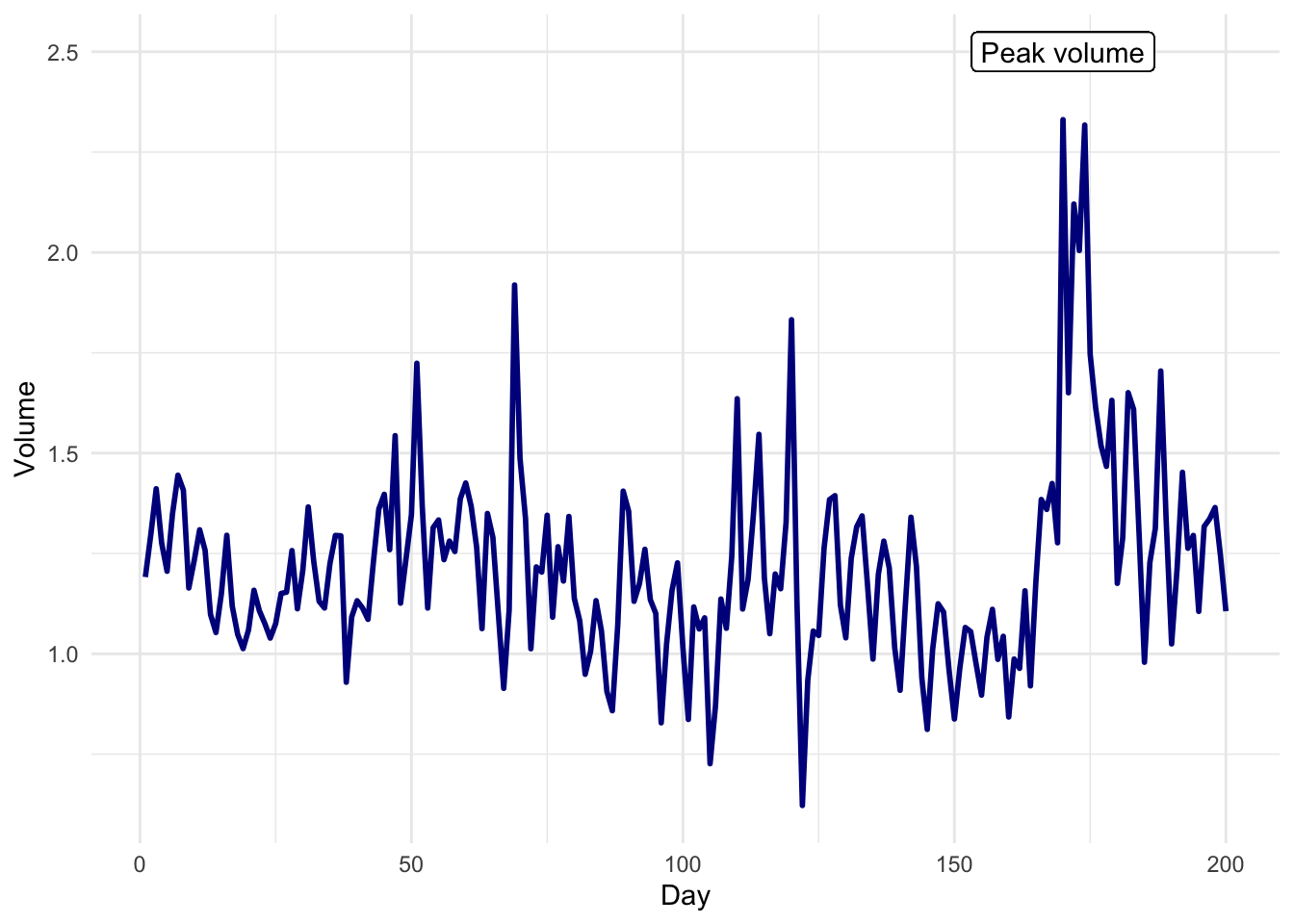
#lineplot
#绘制line plot
Smarket[1:200, ] %>%
  mutate(Day = 1:200) %>%
  ggplot(aes(x = Day, y = Volume)) +
  geom_line(colour = "#00008b", size = 1) +
  geom_label(aes(x = 170, y = 2.5, label = "Peak volume")) +
  theme_minimal()
Faceting(分成多个小图)
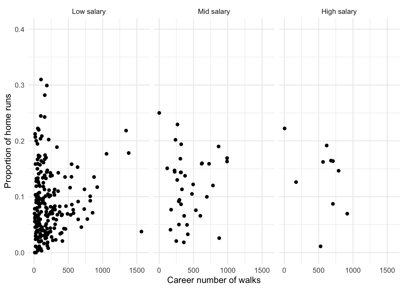
- Create a data frame called
baseballbased on theHittersdataset. In this data frame, create a factor variable which splits players’ salary range into 3 categories. Tip: use thefilter()function to remove the missing values, and then use thecut()function and assign nicelabelsto the categories. In addition, create a variable which indicates the proportion of career hits that was a home run.
baseball <-
  Hitters %>%
  filter(!is.na(Salary)) %>%
  mutate(
    Salary_range = cut(Salary, breaks = 3,
                       labels = c("Low salary", "Mid salary", "High salary")),
    Career_hmrun_proportion = CHmRun/CHits
  )
- Create a scatter plot where you map
CWalksto the x position and the proportion you calculated in the previous exercise to the y position. Fix the y axis limits to (0, 0.4) and the x axis to (0, 1600) usingylim()andxlim(). Add nice x and y axis titles using thelabs()function. Save the plot as the variablebaseball_plot.
baseball_plot <-
  baseball %>%
  ggplot(aes(x = CWalks, y = Career_hmrun_proportion)) +
  geom_point() +
  ylim(0, 0.4) +
  xlim(0, 1600) +
  theme_minimal() +
  labs(y = "Proportion of home runs",
       x = "Career number of walks")

baseball_plot
baseball_plot + facet_wrap(~Salary_range)