3.3 EDA - 查看、探索数据
The boys data
#查看数据
head(boys)
tail(boys)
summary(boys)
#查看某个变量是不是已经排序了
!is.unsorted(boys$age)
#histogram
#绘制histogram
boys %>%
  ggplot(aes(x = age)) +
  geom_histogram(fill = "dark green") +
  theme_minimal() +
  labs(title = "Distribution of age")
#barchart
#histogram和barchart的区别:Histograms visualize quantitative data or numerical data数字, whereas bar charts display categorical variables类别.
#绘制barchart
boys %>%
  ggplot(aes(x = gen)) +
  geom_bar(fill = "dark green") +
  theme_minimal() +
  labs(title = "Distribution of genital Tanner stage")
Assessing missing data
#missing
#查看missing data(如何解读参考week 3课程网页)
md.pattern(boys)

#Create a missingness indicator for the variables
boys_mis <- boys %>%
  mutate(gen_mis = is.na(gen),
         phb_mis = is.na(phb),
         tv_mis  = is.na(tv))

#Assess whether missingness in the variables `gen` is related to someones age.
boys_mis %>%
  group_by(gen_mis) %>%
  summarize(age = mean(age))

#Create a histogram for the variable age, faceted by missing value
boys_mis %>%
  ggplot(aes(x = age)) +
  geom_histogram(fill = "dark green") +
  facet_wrap(~gen_mis) +
  theme_minimal()
#scatterplot 见3.2
Visualizing the boys data
#boxplot 见3.2
#densityplot 见3.2
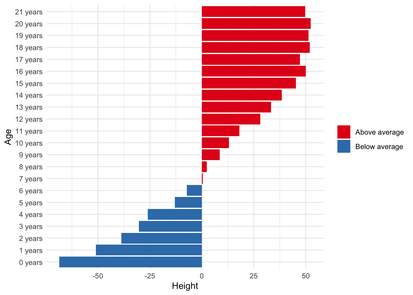
#barchart #divergingbarchat
boys %>%
  mutate(Age = cut(age, 0:22, labels = paste0(0:21, " years")),
         Height = hgt - mean(hgt, na.rm = TRUE)) %>%
  group_by(Age) %>%
  summarize(Height = mean(Height, na.rm = TRUE)) %>%
  mutate(color = ifelse(Height > 0, "Above average", "Below average")) %>%
  ggplot(aes(x = Height, y = Age, fill = color)) +
  geom_bar(stat = "identity") +
  scale_fill_brewer(palette = "Set1") +
  theme_minimal() +
  theme(legend.title = element_blank())
Regression visualization
#bind #binddataframe 见3.1
#linearregression #consistent
#assess whether the results of data sets appear consistent by adding a linear regression line
elastic %>%
  ggplot(aes(x = stretch, y = distance, col = Set)) +
  geom_point() +
  geom_smooth(method = "lm") +
  scale_color_brewer(palette = "Set1") +
  theme_minimal() +
  labs(title = "Elastic bands data")
#regressionmodel #regression
# fit a regression model with y = distance on x = stretch using lm(y ~ x, data)
fit1 <- lm(distance ~ stretch, elastic1)
#determine the fitted values and the standard errors of the fitted values, and the proportion explained variance R2
fit1 %>% predict(se.fit = TRUE)
fit1 %>% summary()
fit1 %>% summary() %$% r.squared
#Study the residual versus leverage plots
fit1 %>% plot(which = 5)
fit1$residuals
#Use the elastic2 variable stretch to obtain predictions on the model fitted on elastic1.
pred <- predict(fit1, newdata = elastic2)

#make a scatterplot to investigate similarity between the predicted values and the observed values for elastic2
pred_dat <-
  data.frame(distance = pred,
             stretch  = elastic2$stretch) %>%
  bind_rows(Predicted = .,
            Observed  = elastic2,
            .id = "Predicted")

pred_dat %>%
  ggplot(aes(stretch, distance, col = Predicted)) +
  geom_point() +
  geom_smooth(method = "lm") +
  scale_color_brewer(palette = "Set1") +
  theme_minimal() +
  labs(title = "Predicted and observed distances")